Infographics are eye-catching tools that help readers digest large amounts of information more easily. Studies show that infographics can improve reading comprehension by 50%, making them invaluable when you need to present complex data in an engaging way.
Did you know that blog articles that include infographics can generate 178% more inbound links and 72% more views than all other posts? Imagine the impact this can have on your marketing campaigns!
If you are looking for the right types of infographics to incorporate into your marketing strategy, you are in the right place. In this blog, we’ll explain the 8 types of Interactive Infographics and when to apply them to get amazing results.
Now, let’s zoom in on an industry that often gets left behind in the flashier corners of marketing—dentistry. Dentists provide essential care, yet their marketing often doesn’t reflect the precision or professionalism of their work.
That’s where interactive infographics can be a game-changer. Whether it’s explaining the stages of gum disease, breaking down insurance coverage, or showcasing cosmetic procedure timelines, infographics can help demystify dental care for patients and make services feel more accessible and less intimidating.
This is exactly the kind of visual strategy The Dental SEO Group excels at. By combining compelling graphics with targeted SEO tactics, they help dental practices not only rank higher in search engines but also connect meaningfully with patients.
Imagine an interactive infographic showing how a smile makeover works—each step clickable, educational, and shareable. These aren’t just pretty pictures; they’re strategic tools that build trust, boost engagement, and convert casual browsers into loyal patients.
Interactive infographics are not only informative but also incredibly engaging—they break down complex procedures, ease patient anxieties, and create a sense of transparency that today’s patients deeply value. This approach becomes even more impactful when paired with a dental team that truly understands how to connect with its community.
Known for their patient-centered approach, smiles restored dentists demonstrate how thoughtful marketing can reflect the same precision found in quality dental care Whether they’re showcasing before-and-after smile transformations, explaining the science behind dental implants, or offering interactive content on preventative care, they meet patients where they are—with clarity, empathy, and accessibility.
By embracing modern marketing tools like infographics, they not only highlight the services they offer but also reinforce the trust and connection that keep patients coming back. Here are the 8 most popular types of infographics; jump to your preferred type:
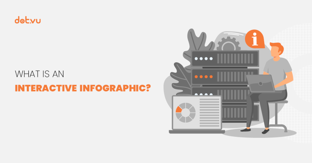
What are Interactive Infographics?
Infographics are visual representations that use imagery and charts with minimal text to provide a clear and easy-to-understand overview of a topic.
Interactive Infographics take this a step further by incorporating elements like hotspots, polls, surveys, quizzes, Interactive Videos, and animations. These interactive features make the content more engaging and significantly enhance information retention.
There are various types of infographics, each serving a different purpose. In this blog post, we’ll focus on Interactive Infographics, which invite users to actively engage with the content. Adding interactive elements to your infographics can boost engagement and improve information retention even more. So, let’s dive in and explore the creative possibilities!
Read more: What is an Interactive Infographic
8 Types of Interactive Infographics
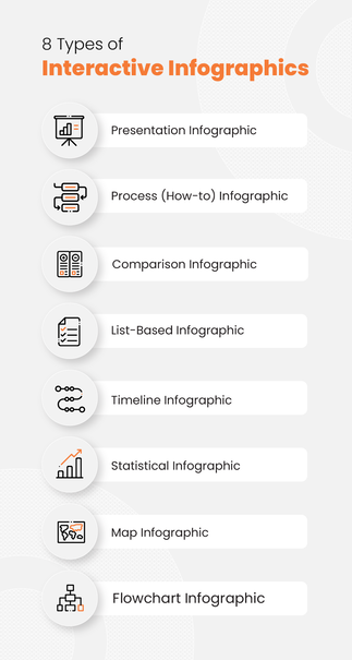
1. Presentation Infographic
The Presentation Infographic helps to tell a compelling story about the content that you want to present. Use it as a visual summary to present almost any kind of content. It is a great way to feature all information in one engaging, clickable infographic that can reveal more details when clicked.
Useful for: Company profiles, new product info, or any general data that you would like to add some flair to.
Potential interactive elements you can add: hotspots, interactive videos, scratch card to reveal more information, and more!
Customize this template and create your own Presentation Infographic
2. Process (How-to) Infographic
Use Process Infographics to bring your audience through a process steps-by-step. You can also use this type of infographic to explain how something is done. The best part about making this infographic interactive is the possibility to expand each step, so that it doesn’t look cluttered. Plus, you can add in tutorial videos to guide the audience on the tougher steps better.
Useful for: Recipes, Product Guides, Platform Guides, or any types of guides.
Potential interactive elements you can add: hotspots, Marketing Games, contests, gated sections, Interactive Videos, polls, and many more!
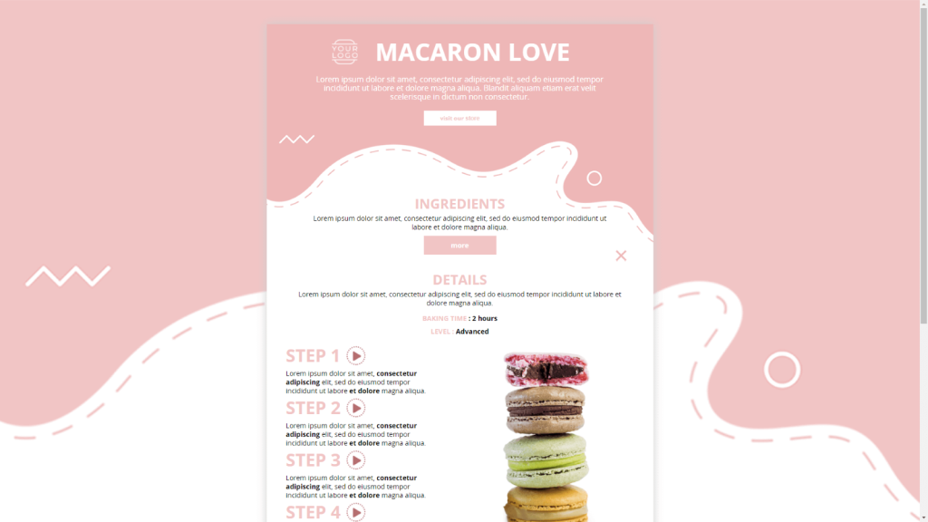
Customize this template and create your own Process Infographic
3. Comparison Infographic
In this type of infographic, you can help your customers decide which product or service to purchase by comparing them side by side. This is especially helpful when the options are very similar. Highlight the differences and plus points between them and your customer can choose according to their needs.
It’s also a great way to showcase the value of a product in comparison to another similar product. Add a “Buy Now” button where viewers can directly add an item to their cart. That way, you shorten the buying process and secure your sale.
Useful for: Comparison of your own products to help the buyer choose, competitor comparison, or any other similar things you would like to compare.
Potential interactive elements you can add: hotspots, polls, product recommender, interactive videos, “read more” buttons with hidden sections, etc.
Customize this template and create your own Comparison Infographic
4. List-Based Infographic
A List-Based Infographic is useful when you want to list several items. It allows you to convey information without compromising on visuals.
One of the advantages of creating an Interactive List-Based Infographic is the ability to create collapsible sections. This allows you to promote your products or services under each point on your list.
Useful for: Tips & tricks, feature lists, product lists, or any other types of lists.
Potential interactive elements you can add: hotspots, Interactive Videos, polls, surveys, assessments, CTA buttons, animations, gated Marketing Games, accordion, etc.

Customize this template and create your own List-Based Infographic
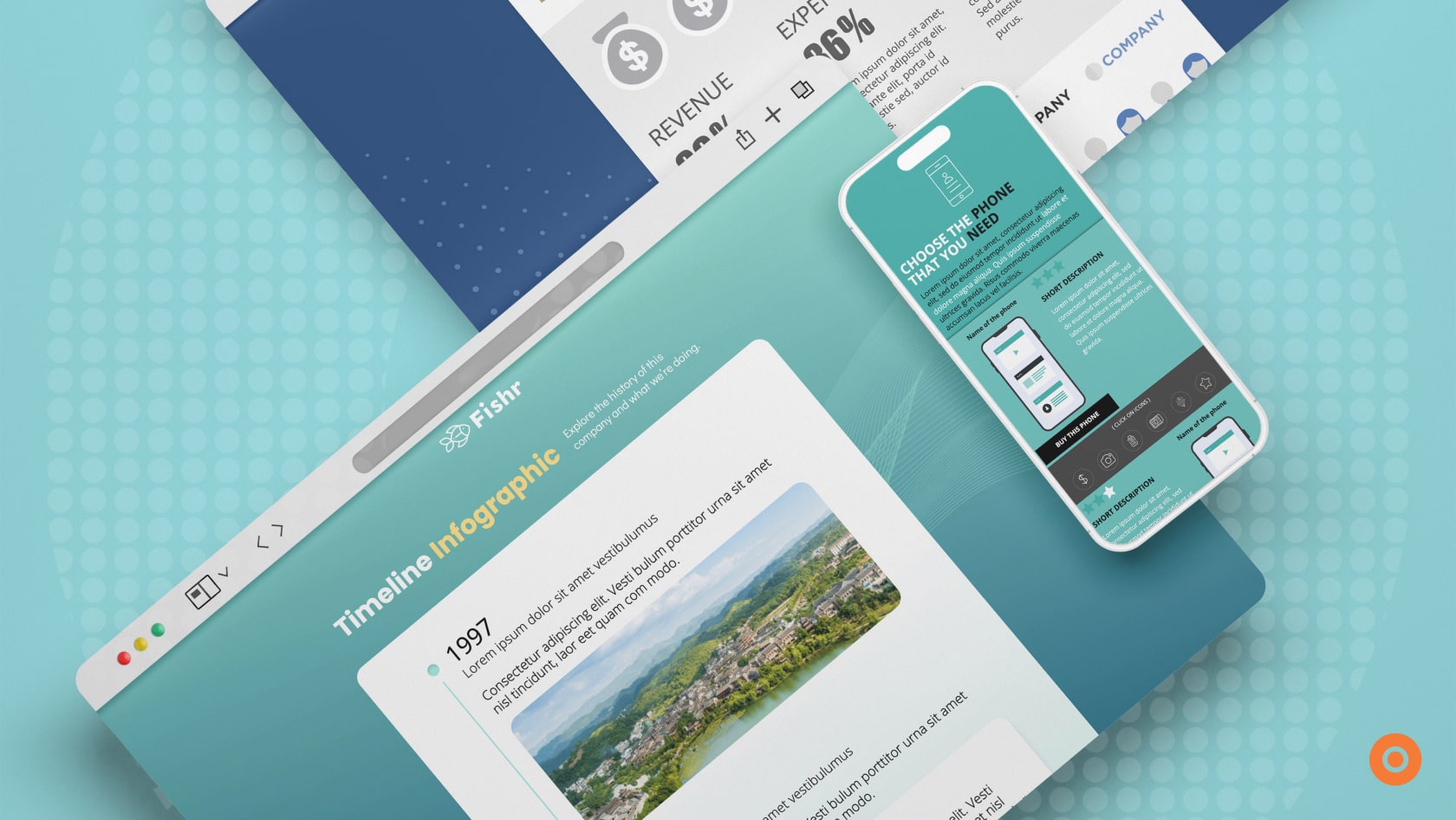
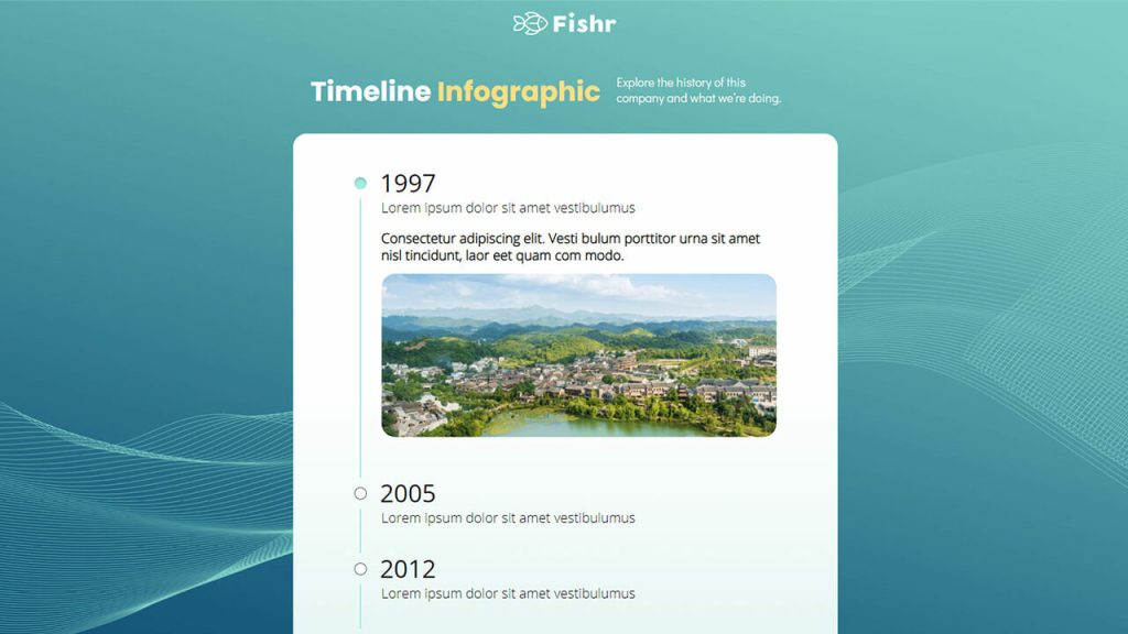
5. Timeline Infographic
An Interactive Timeline Infographic is great for highlighting something that has evolved over time or telling a story in chronological order. You can add lots of visual elements and icons to make it interesting.
They are easy to read and can interest viewers enough for them to read to the end. You can also add a lot more information under each time milestone without making it overcrowded. You can achieve that with hotspots, videos, or by providing details on mouseovers.
Useful for: Brand Story, Industry Story, Product Story, Partnership Story, Trend Story, etc.
Potential interactive elements you can add: Educative quizzes, surveys, hotspots, mouseovers, interactive or regular videos, assessments, etc.
Customize this template and create your own Timeline Infographic
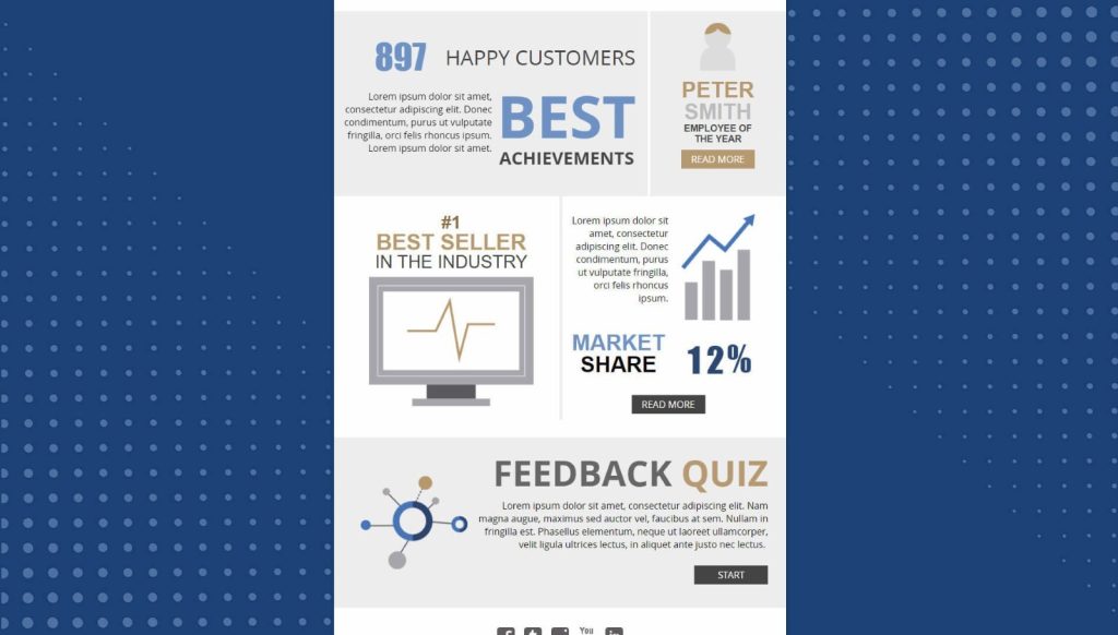
6. Statistical Infographic
People tend to hit the snooze button once they hear the word “statistics.” Make your charts and figures come to life and keep readers awake with Interactive Statistical Infographics.
Using a Statistical Infographic is a good way to share statistics with your target audience. They usually contain pie charts, pictograms, maps, and bar graphs that help the audience visualize the data better. Add interactive elements to bring your audiences’ attention to key information in the infographic.
Useful for: Company report, demographics report, survey results, research information, etc.
Potential interactive elements you can add: Hotspots, polls, interactive or regular videos, calculators, a gated lead form to see the full report, etc.
Customize this template and create your own Statistical Infographic
7. Map Infographic
The Map or Location Infographic provides an easy way to communicate any data across a certain geographical area. For example, if you want to share statistics about different countries, use a Map Infographic. This invites the audience to look closely at the numbers and it helps them compare the data between the various places.
You can also add interactive elements to make it visually appealing and entertaining for your audience.
Useful for: Showing company expansion, product & service coverage, population density, cost of living, and so on.
Potential interactive elements you can add: hotspots & pop-ups, surveys, animations, gated sections, read more buttons.
8. Flowchart Infographic
This infographic is useful in showing an information stream, or the sequence of different steps or actions. It helps to walk the audience through a process. Some parts could have yes or no questions that would point the audience to the next step based on their responses.
This type of infographic boosts engagement while giving the audience a very clear idea of what the process is about. Because it guides people individually through the various steps, it feels more personal. You can even use it to steer potential customers toward selecting your product as the solution to their needs.
It can also be used internally for onboarding new employees, explaining company processes, or to troubleshoot common problems.
Useful for: Product & service categories, features, job functionality, troubleshooting, and basically anything else where you can show the relation between different concepts.
Potential interactive elements you can add: Interactive Videos, pop-ups & hotspots, contests, quizzes, Marketing Games, surveys
Select a type of infographic and let’s achieve your goals!
Interactive Infographics are useful marketing tools and inbound marketing tools that can improve information retention and generate higher conversion rates. They’re highly valuable when it comes to sharing information as they are versatile, offer many opportunities, and help you nurture meaningful relationships by empowering your customers with information.
Though the process of creating an infographic looks complicated, that’s where we come in! We’ve made the process super simple – just use our customizable templates and viola, your infographic is ready!
Dot.vu’s team of expert Interactive Content creators has prepared ready-made templates that are easily customizable. They’re very user-friendly, and no coding is needed. Get started on our 14-day free trial today and let your creativity flow!